
David Yang
Tips and posts for iOS developers from an iOS developer.
The Art of the Corner Radius
Corner radius are a very common thing in app designs. It’s very easy to achieve in SwiftUI. But when embedding multiple content with rounded corners, are you doing it right? Here are a few tricks of mine.
The basics
The 8pt Grid Guide system
First of all, I like to use the “8-Point Grid” guide system. It’s a simple rule where you use as much as possible multiples of 8 as values for your spacings, paddings, margins, etc. And I also use that for corner radius.
The reason is quite simple: when implementing any mockup design, I just use the closest multiple of 8 that matches a value in order to have a consistent UI, even if that value is not exactly the one used by the designer.
Trust me, it will make your code more readable, maintainable and your UI will be more consistent.
We’ll get back to it later to illustrate how it’s especially useful with rounded corners.
Applying a rounded corner shape to any content
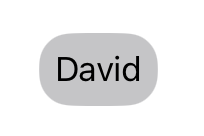
If you want to apply a corner radius, a simple approach would be to use the .cornerRadius() modifier.
Let’s apply a 16pt corner radius.
Text(verbatim: "David")
    .padding(8)
    .background(.tertiary)
    .cornerRadius(16)
Although it’s still working for now, this method is deprecated. So the equivalent now would be to use the .clipShape() modifier.
Text(verbatim: "David")
    .padding(8)
    .background(.tertiary)
    .clipShape(.rect(cornerRadius: 16))
Note: By default, the style is set to
.continuouswhich is commonly the recommended style. A.continousstyle makes the border smoother. This style was introduced with iOS 7.
Add a solid border with a rounded corners
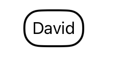
In order to apply a border with rounded corners, you can use the following code:
Text(verbatim: "David")
    .padding(8)
    .overlay {
        RoundedRectangle(cornerRadius: 16)
            .stroke(lineWidth: 2)
    }
Doing both…
Of course you can combine both.
Text(verbatim: "David")
    .padding(8)
    .background(.tertiary)
    .clipShape(.rect(cornerRadius: 16))
    .overlay {
        RoundedRectangle(cornerRadius: 16)
          .stroke(lineWidth: 2)
    }
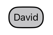
But then you could also simplify it by applying the background color on the RoundedRectangle that is overlayed and get the same result.
Text(verbatim: "David")
    .padding(8)
    .overlay {
        RoundedRectangle(cornerRadius: 16)
            .fill(.tertiary)
            .stroke(.black, lineWidth: 2)
        }
Embedded content with rounded corners
Sometimes you end up having to embed multiple contents with rounded corners.
VStack(alignment: .leading, spacing: 16) {
    Text(verbatim: "David")
        .padding(8)
        .overlay {
            RoundedRectangle(cornerRadius: 16)
                .fill(.tertiary)
                .stroke(.black, lineWidth: 2)
            }

    Text("35 year-old iOS developer.")
}
.padding(16)
.background(.teal)
.clipShape(.rect(cornerRadius: 16))
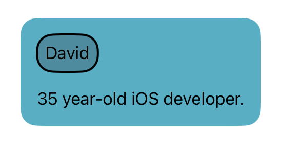
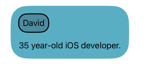
But something looks off, don’t you think?
For the most UI-sensitive among you, you may notice that the curve of the rounded corners between the David Text component and its parent’s are not visually matching.
The reason is simple: both have a 16pt corner radius. But the parent container is actually much bigger and also has a 16pt padding. Therefore, it needs to have a bigger corner radius value.
The fix
In order to fix that, we need to apply the following formula:
Parent's corner radius = Content padding + Child's corner radius
For a visual way to understand that rule, let’s picture it this way:
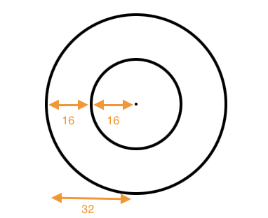
- The inner circle has a radius value of 16.
- The outer circle has a padding value of 16.
- Therefore, the outer circle has a radius value of 32.
Now to get back to our sample code, we need to use 32 (16 + 16) as the corner radius of our VStack.
VStack(alignment: .leading, spacing: 16) {
    Text(verbatim: "David")
        .padding(8)
        .overlay {
            RoundedRectangle(cornerRadius: 16)
                .fill(.tertiary)
                .stroke(.black, lineWidth: 2)
            }

    Text("35 year-old iOS developer.")
}
.padding(16)
.background(.teal)
.clipShape(.rect(cornerRadius: 32))
The power of the 8-Point Grid Guide
It’s basic maths and logic, but since we used multiples of 8 for both our padding and corner radius, the result value is also a multiple of 8.
As a consequence, using the 8-Point Grid Guide makes it easier to “guess” the value of the container’s corner radius.
Needless to say that with more arbitrary values and a complex components hierarchy, that value would have been a little more difficult to guess.