
David Yang
Tips and posts for iOS developers from an iOS developer.
The alternative to SwiftUI's Spacer
Early on, SwiftUI introduced Spacer. But did you know that you can replace it with something else in most use cases?
According to Apple’s documentation, a Spacer is:
A flexible space that expands along the major axis of its containing stack layout, or on both axes if not contained in a stack.
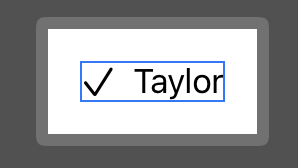
So let’s start a simple HStack.
struct ContentView: View {
    var body: some View {
        HStack {
            Image(systemName: "checkmark")
            Text("Taylor")
        }
        .border(.blue)
        .padding()
    }
}
Spacer
From there we can add a leading space.
struct ContentView: View {
    var body: some View {
        HStack {
            Spacer()
            Image(systemName: "checkmark")
            Text("Taylor")
        }
        .border(.blue)
        .padding()
    }
}
Or we can have a trailing space.
struct ContentView: View {
    var body: some View {
        HStack {
            Image(systemName: "checkmark")
            Text("Taylor")
            Spacer()
        }
        .border(.blue)
        .padding()
    }
}
Or have a space between the Image and the Text.
struct ContentView: View {
    var body: some View {
        HStack {
            Image(systemName: "checkmark")
            Spacer()
            Text("Taylor")
        }
        .border(.blue)
        .padding()
    }
}
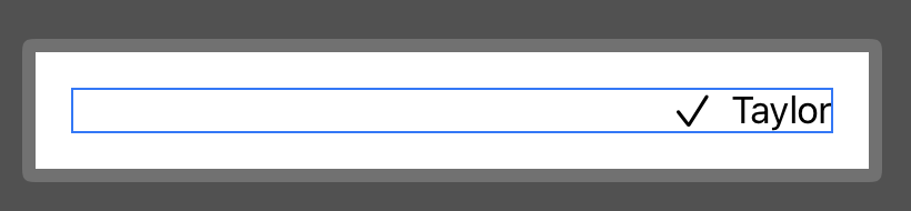
But we can actually achieve those same behaviors with the .frame(maxWidth:maxHeight:alignment:) modifier.
Using the frame modifier
By setting maxWidth to .infinity, we’re indicating that the container view should use as much horizontal space as it can.
The .trailing alignment will make sure the content is aligned to the trailing end.
struct ContentView: View {
    var body: some View {
        HStack {
            Image(systemName: "checkmark")
            Text("Taylor")
        }
        .border(.blue)
        .padding()
        .frame(maxWidth: .infinity, alignment: .trailing)
    }
}
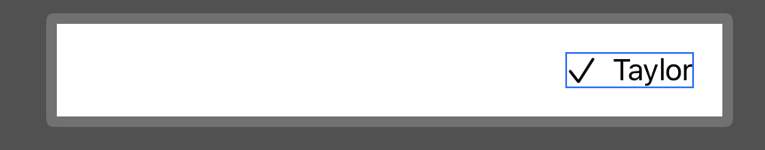
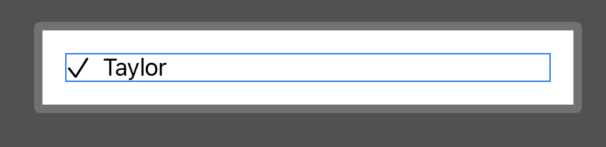
You can also choose to use a .leading alignment.
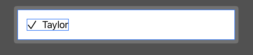
struct ContentView: View {
    var body: some View {
        HStack {
            Image(systemName: "checkmark")
            Text("Taylor")
        }
        .border(.blue)
        .padding()
        .frame(maxWidth: .infinity, alignment: .leading)
    }
}
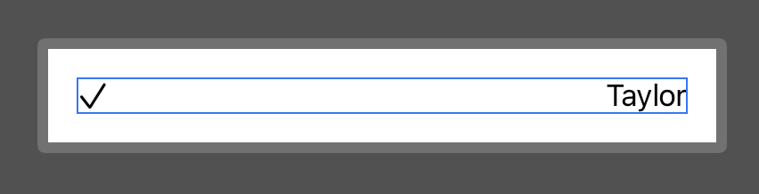
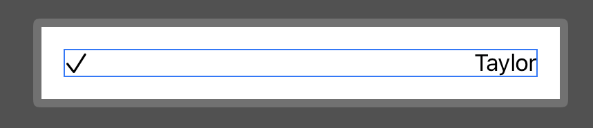
And if you want to add a space between the Image and the Text, you can just use the frame modifier on one of them and set the desired alignment.
struct ContentView: View {
    var body: some View {
        HStack {
            Image(systemName: "checkmark")
            Text("Taylor")
                .frame(maxWidth: .infinity, alignment: .trailing)
        }
        .border(.blue)
        .padding()
    }
}
The difference
Visually, both approach will look exactly the same (if you forget about the blue border which is only here to understand the behavior of all of this). But now, you’re setting the behavior directly on the container instead of adding an extra and flexible component inside of it.
As a consequence, using a .frame modifier will save you a lot in performance over a Spacer, especially in lists or long horizontal/vertical stacks.
Conclusion
Of course Spacer can still be useful in more complex components. But my advice would be to try to use Spacer as less as you can for performance costs and readability.
I’m also only working with HStack here in my code samples, but dealing with VStack is mostly the same with the maxHeight parameter and some .top or .bottom alignment.
For more complex components, you can also combine horizontal and vertical alignment with .topLeading, .topTrailing, .bottomLeading, .bottomTrailing or .center alignment.